Emerson
Crafting an Intuitive Dashboard for DeltaV Logbooks
00
problem
Plant operators and supervisors needed a fast, reliable way to log and retrieve shift information, because the existing Logbook made shift timings hard to locate, buried past observations, and presented data in a way operators didn't trust and creating friction in a workflow where speed and accuracy directly affect plant operations.
solution
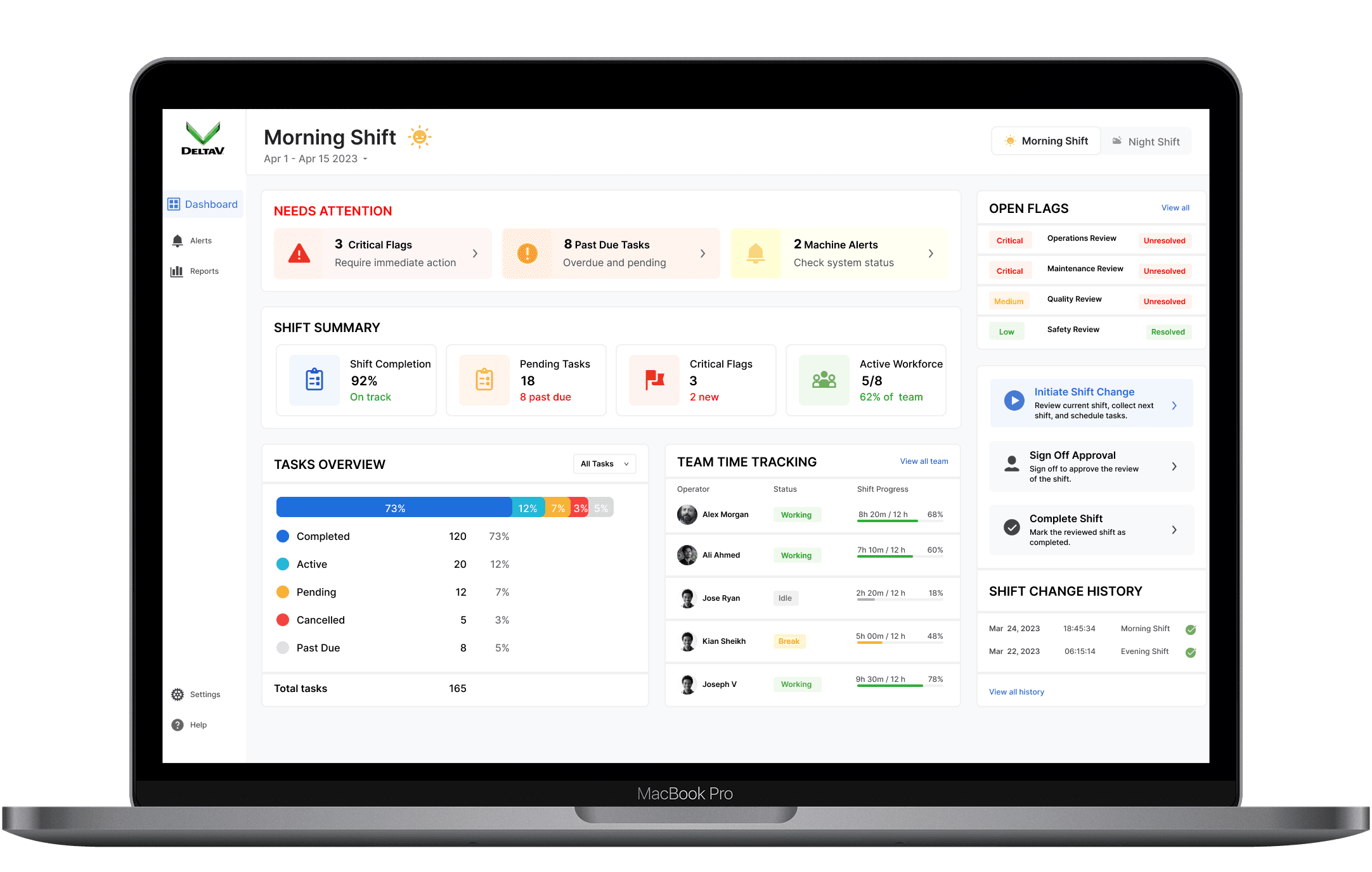
Logbook allows users to access daily operations via a visually engaging interface that encourages action without overwhelming users.
Evidence
Stakeholder alignment (starting point): The project began with the EMEA product head and the Logbook PMM, who flagged this as an urgent client-facing problem by establishing why this mattered before any design work started.
Heuristic audit: An audit against Nielsen's heuristics surfaced multiple violations in the existing Logbook by informing what to specifically probe for in user research rather than going in blind.
User interviews (6 operators/supervisors): Interviews focused on how operators actually use the Logbook day-to-day, what they need from it, and where it breaks down. Four consistent pain points emerged:
Shift timings were hard to locate
Graphs/data presentation lacked credibility
Limited access to past observations
Poor visibility into task information
Approach
A full IA overhaul was on the table but rejected deliberately: rebuilding the information architecture from scratch would have increased cognitive load and retraining costs for an existing, trained user base.
It's not an acceptable tradeoff for an industrial tool operators rely on under time pressure. Instead, the design optimized for:
Familiarity
Scannability
Faster decision-making
Reduced cognitive load
Better hierarchy
Better accessibility
This constraint shaped every subsequent design decision and the goal wasn't a "wow" redesign, it was removing friction from an existing mental model operators already trusted.

Validation
Tested with 16 participants against a structured testing script covering every core task in the redesigned flow: task by task, not just a general walkthrough.
This surfaced concrete, actionable feedback that fed directly back into design refinements before launch.
Results
Shipped on time, with:
70% surge in dashboard engagement
95%+ of users reporting the Logbook was significantly easier to access
year
2022
timeline
2 weeks
tools
Dashboard, Data Visualization
category
UI/UX
01
02

see also


