John Deere Financial
Driving Customer Satisfaction with an Improved Accounts Summary Page
00

problem
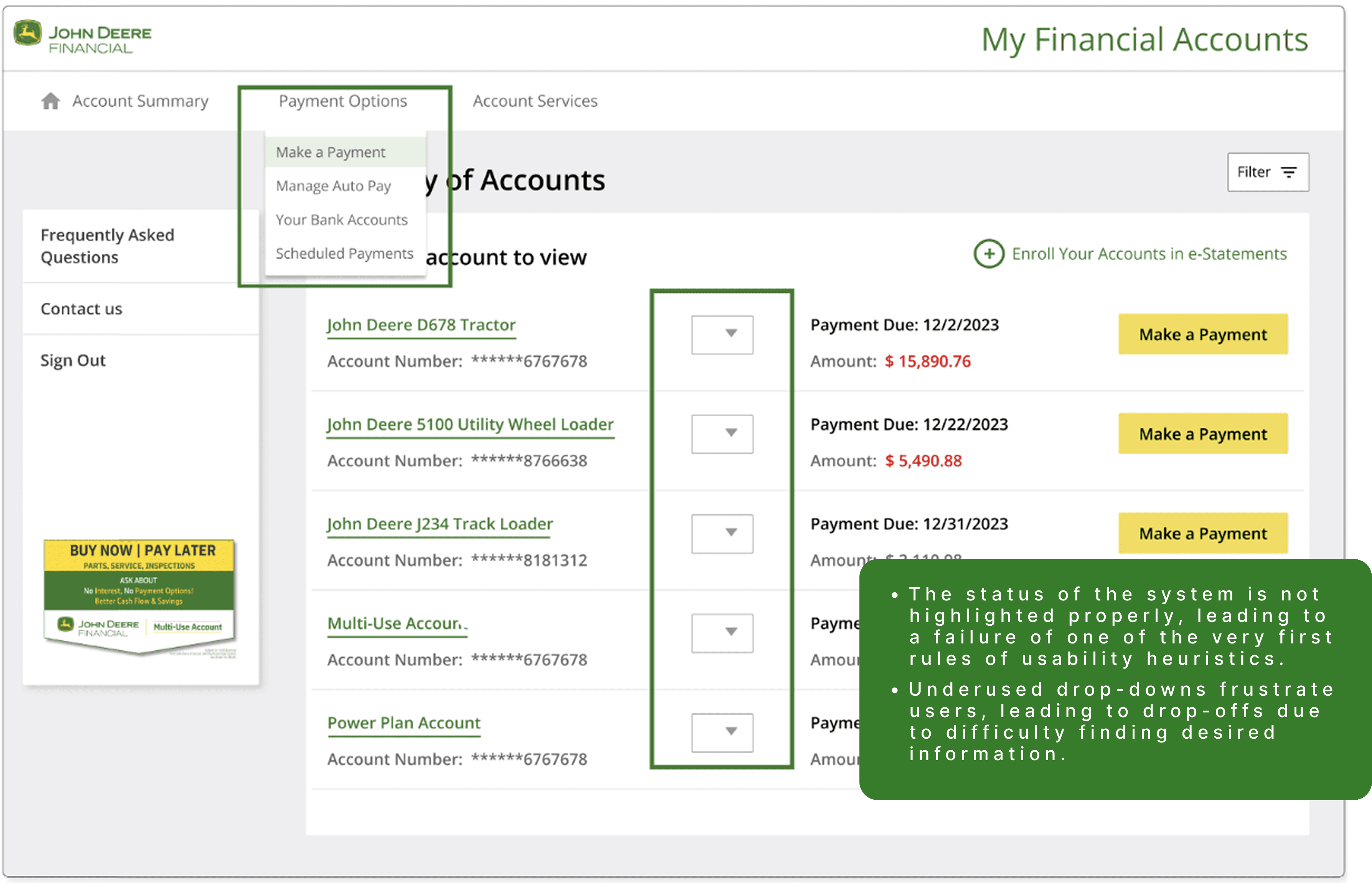
Desktop users of the MyFinancial App needed a way to find key account information quickly, because the existing dropdown-menu navigation buried by only 15% of desktop users and 45% of mobile users ever interacted with it. This was surfacing as rising negative feedback about "poor navigation" and, per session recordings, users visibly searching the screen, finding nothing, and logging out without completing their task.
solution
As the UX Designer for the MyFinancial Application, I led the redesign of a complex accounts summary page, turning a source of user frustration into a streamlined, intuitive experience.
Evidence
Analytics (Smartlook): Dropdown menu engagement was critically low by 15% desktop, 45% mobile which signaling the primary navigation pattern wasn't discoverable.
Session recordings: Watched real user sessions showing repeated scanning/wandering behavior on the screen before task abandonment.
The qualitative confirmation behind the low click-through numbers. This is what turned "navigation is bad" from a vague complaint into a specific, observable failure pattern.
Approach
Based on the discoverability gap, I sketched multiple navigation alternatives by including alternate placements and interaction patterns beyond the dropdown and evaluated them against the core requirement.
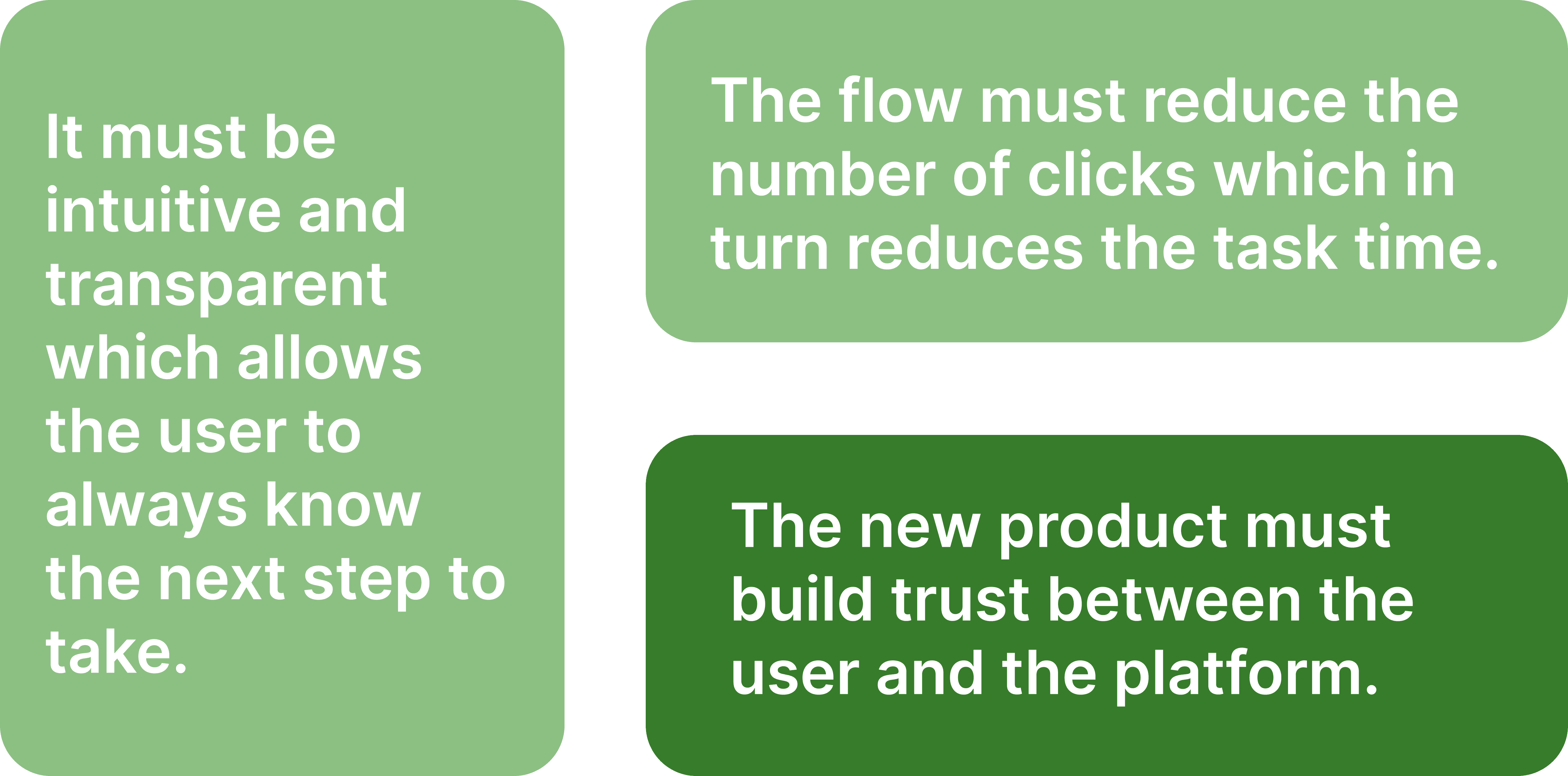
- Navigation needed to be visible without requiring a click to reveal it.
- Working with the PM, we aligned early on a persistent sidebar as the strongest option, trading the low-visibility dropdown pattern for one that's always in view.
Usability testing wasn't in scope for this cycle, so analytics and session recordings served as the primary pre-launch signal, with post-launch metrics used to validate the direction.
Redesign Goals
Make it simple, but significant
Results
Shipped March 16, 2025, with:
65% increase in navigation clicks
42% reduction in negative navigation-related feedback
78% increase in CSAT within one week of launch
Sidebar showing sustained, heightened engagement post-launch
year
2024
timeline
Shipped March 16, 2024
tools
UX Audits, Design Strategy
category
UI/UX
01

02

see also